Branding Beloved Air & Space Museum & Digital Experience
Reimagining how the museum shows up—online and on-site—by revealing what’s inside, amplifying its wonder, and driving action through immersive visuals, clearer information, and bolder calls to action that support ticket sales, memberships, and donations.
Air & Space Museum Branding & Digital Experience
Reimagining how the museum shows up—online and on-site—by revealing what’s inside, amplifying its wonder, and driving action through immersive visuals, clearer information, and bolder calls to action that support ticket sales, memberships, and donations.
Branding Beloved Air & Space Museum & Digital Experience
Reimagining how the museum shows up—online and on-site—by revealing what’s inside, amplifying its wonder, and driving action through immersive visuals, clearer information, and bolder calls to action that support ticket sales, memberships, and donations.
Overview:
Overview:
Overview:
Overview:
The San Diego Air & Space Museum holds some of the most extraordinary aviation and space artifacts in the world—but much of that excitement wasn’t visible from the outside. The website lacked clarity, energy, and compelling visuals, while physical signage and wayfinding felt inconsistent and understated.
This project reimagined the museum’s digital and physical presence to spark curiosity before guests arrive, guide them confidently once inside, and strengthen the brand across every touchpoint.
My Role:
My Role:
My Role:
My Role:
I led this project end-to-end as a solo experience designer, owning both strategy and execution.
Responsibilities included:
Experience strategy & audience definition
Concept development & narrative framing
User flows & interaction design
Visual design & rapid prototyping

The Story Begins. The Challenge:
Mobile and desktop information was difficult to find and understand
Calls to action for tickets, memberships, and donations lacked urgency and visibility
The website failed to showcase the scale, beauty, and uniqueness of the museum’s exhibits
Brand presence felt fragmented across digital and physical touchpoints
On-site signage and wayfinding lacked consistency and impact
The museum logo was difficult to read from a distance and needed stronger visibility
The Vision:
The Story Begins: The Challenge
The Story Begins: The Challenge
Excitemend. Discovery. Anticipation.
The goal was to make the museum feel as inspiring from the outside as it is inside—creating a sense of wonder that motivates guests to visit, explore, and support the institution.
Mobile and desktop information was difficult to find and understand
Calls to action for tickets, memberships, and donations lacked urgency and visibility
The website failed to showcase the scale, beauty, and uniqueness of the museum’s exhibits
Brand presence felt fragmented across digital and physical touchpoints
On-site signage and wayfinding lacked consistency and impact
The museum logo was difficult to read from a distance and needed stronger visibility
The Vision:
Excitemend. Discovery. Anticipation.
The goal was to make the museum feel as inspiring from the outside as it is inside—creating a sense of wonder that motivates guests to visit, explore, and support the institution.
Designing The Journey:
The Vision:
The Vision:
Designing The Journey:
I focused on creating a cohesive, intuitive experience across digital and physical environments.
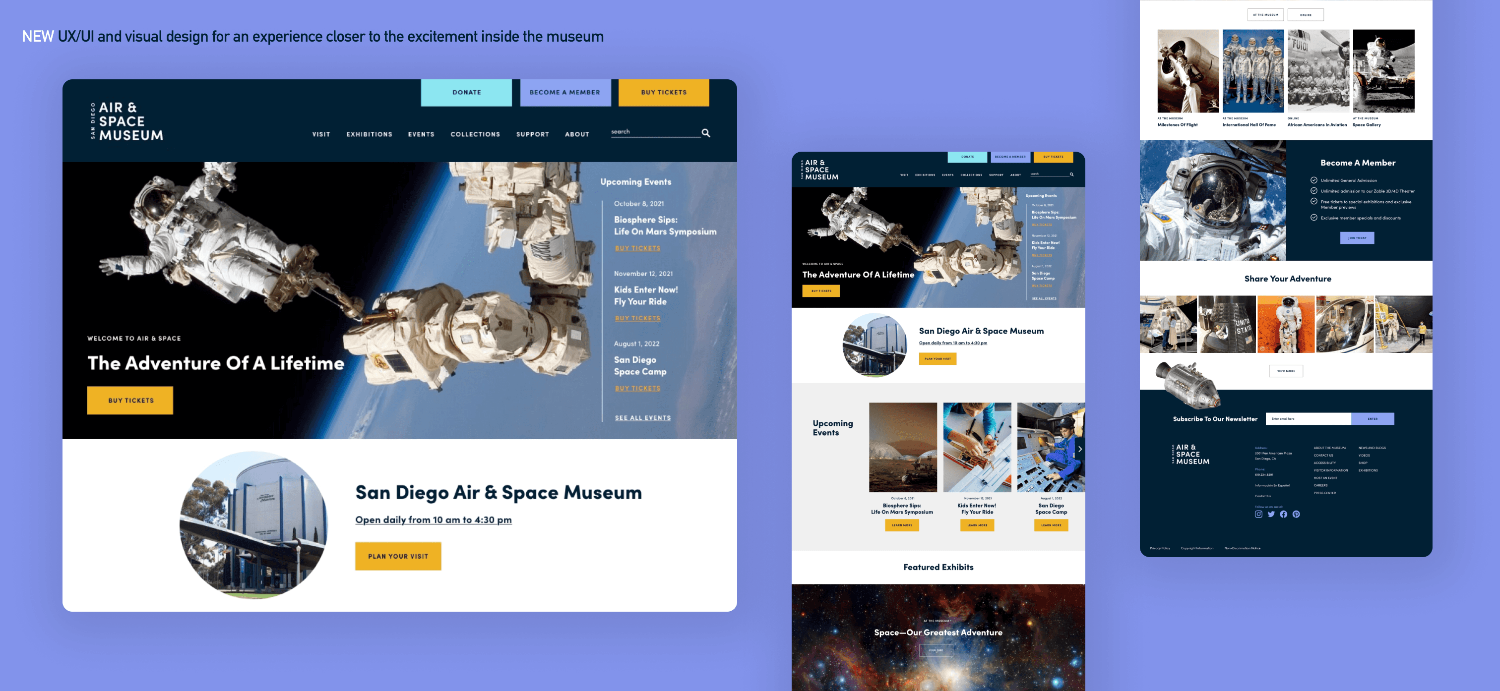
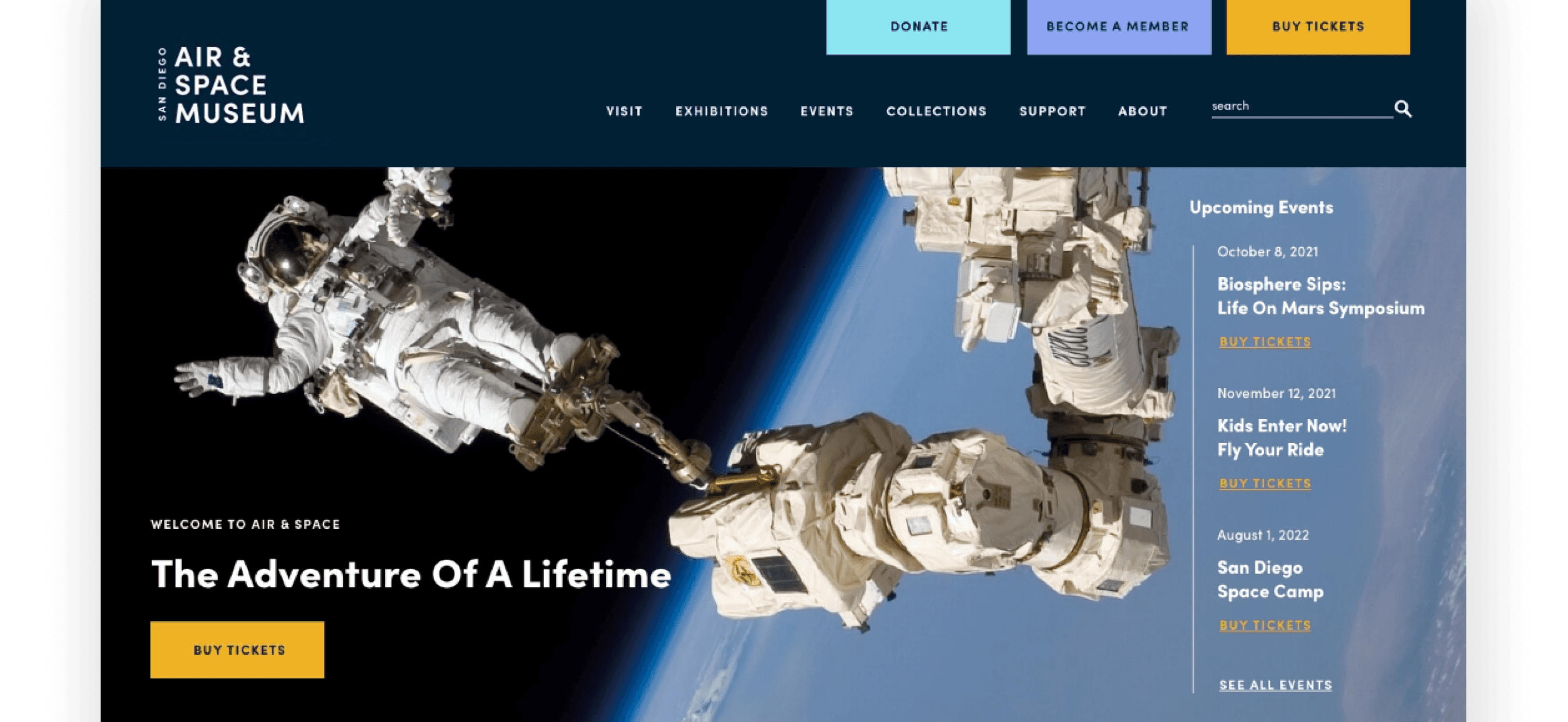
A simplified, easier-to-navigate mobile first website structure
Bold, immersive visuals that highlight real artifacts and exhibits
Clear, confident calls to action at key decision points
Consistent branding across web, signage, and wayfinding
A refreshed, bolder logo treatment for improved readability and presence
Excitemend. Discovery. Anticipation.
The goal was to make the museum feel as inspiring from the outside as it is inside—creating a sense of wonder that motivates guests to visit, explore, and support the institution.
Designing The Journey:
I focused on creating a cohesive, intuitive experience across digital and physical environments.
A simplified, easier-to-navigate mobile first website structure
Bold, immersive visuals that highlight real artifacts and exhibits
Clear, confident calls to action at key decision points
Consistent branding across web, signage, and wayfinding
A refreshed, bolder logo treatment for improved readability and presence
Collaboration & Creative Leadership:
While this was a solo design effort, I partnered closely with the CTO to ground design decisions in business realities. Together, we reviewed ticket sales and membership data, comparing direct SDASM memberships with the Balboa Park Explorer Pass to better understand user behavior and conversion opportunities.
Methods & Craft:
✦ Experience mapping and audience definition
✦ Content hierarchy and information architecture
✦ Interaction and flow design
✦ High-fidelity visual design
✦ Rapid prototyping to validate direction and iterate quickly


Key Experiences Delivered:
Key Experiences Delivered:
Key Experiences Delivered:
✦ Elevated mobile and desk top experience
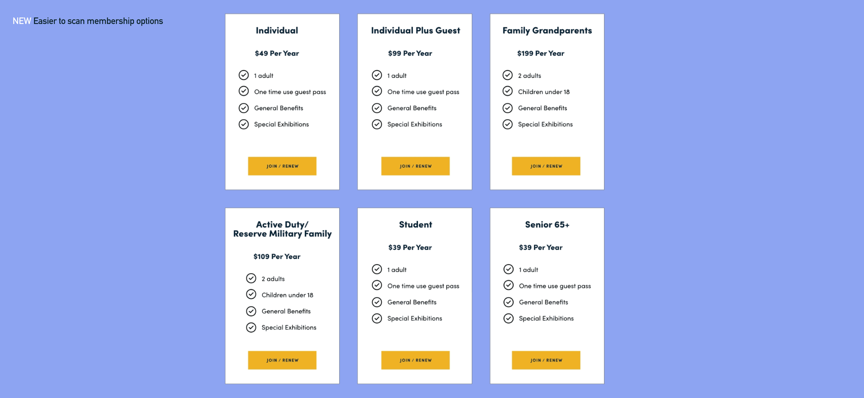
✦ Clearer differentiation and explanation of membership offerings
✦ Improved discoverability and clarity for events and exhibits
✦ Strong, prominent CTAs for ticket purchases and memberships
✦ A unified visual system that connects digital and on-site experiences
Designing
The Journey:
I focused on creating a cohesive, intuitive experience across digital and physical environments.
A simplified, easier-to-navigate mobile first website structure
Bold, immersive visuals that highlight real artifacts and exhibits
Clear, confident calls to action at key decision points
Consistent branding across web, signage, and wayfinding
A refreshed, bolder logo treatment for improved readability and presence

Collaboration & Creative Leadership:
Reflection.
Why It Mattered:
While this was a solo design effort, I partnered closely with the CTO to ground design decisions in business realities. Together, we reviewed ticket sales and membership data, comparing direct SDASM memberships with the Balboa Park Explorer Pass to better understand user behavior and conversion opportunities.
When a museum holds world-class artifacts and stories, guests should feel that magic before they ever walk through the doors. By revealing more of what’s inside—through compelling visuals, clearer information, and a confident brand presence—this work helps attract new visitors, increase support, and ensure guests arrive excited and leave inspired.
Methods & Craft:
✦ Experience mapping and audience definition
✦ Content hierarchy and information architecture
✦ Interaction and flow design
✦ High-fidelity visual design
✦ Rapid prototyping to validate direction and iterate quickly
Reflection.
Why It Mattered:
Reflection.
Why It Mattered:
Reflection.
Why It Mattered:
When a museum holds world-class artifacts and stories, guests should feel that magic before they ever walk through the doors. By revealing more of what’s inside—through compelling visuals, clearer information, and a confident brand presence—this work helps attract new visitors, increase support, and ensure guests arrive excited and leave inspired.
The Story Begins: The Challenge
Mobile and desktop information was difficult to find and understand
Calls to action for tickets, memberships, and donations lacked urgency and visibility
The website failed to showcase the scale, beauty, and uniqueness of the museum’s exhibits
Brand presence felt fragmented across digital and physical touchpoints
On-site signage and wayfinding lacked consistency and impact
The museum logo was difficult to read from a distance and needed stronger visibility
The Vision:
Excitemend. Discovery. Anticipation.
The goal was to make the museum feel as inspiring from the outside as it is inside—creating a sense of wonder that motivates guests to visit, explore, and support the institution.
Designing The Journey:
I focused on creating a cohesive, intuitive experience across digital and physical environments.
A simplified, easier-to-navigate mobile first website structure
Bold, immersive visuals that highlight real artifacts and exhibits
Clear, confident calls to action at key decision points
Consistent branding across web, signage, and wayfinding
A refreshed, bolder logo treatment for improved readability and presence
Key Experiences Delivered:
✦ Elevated mobile and desk top experience
✦ Clearer differentiation and explanation of membership offerings
✦ Improved discoverability and clarity for events and exhibits
✦ Strong, prominent CTAs for ticket purchases and memberships
✦ A unified visual system that connects digital and on-site experiences
Collaboration & Creative Leadership:
While this was a solo design effort, I partnered closely with the CTO to ground design decisions in business realities. Together, we reviewed ticket sales and membership data, comparing direct SDASM memberships with the Balboa Park Explorer Pass to better understand user behavior and conversion opportunities.
Methods & Craft:
✦ Experience mapping and audience definition
✦ Content hierarchy and information architecture
✦ Interaction and flow design
✦ High-fidelity visual design
✦ Rapid prototyping to validate direction and iterate quickly
Reflection.
Why It Mattered:
When a museum holds world-class artifacts and stories, guests should feel that magic before they ever walk through the doors. By revealing more of what’s inside—through compelling visuals, clearer information, and a confident brand presence—this work helps attract new visitors, increase support, and ensure guests arrive excited and leave inspired.
Collaboration & Creative Leadership:
While this was a solo design effort, I partnered closely with the CTO to ground design decisions in business realities. Together, we reviewed ticket sales and membership data, comparing direct SDASM memberships with the Balboa Park Explorer Pass to better understand user behavior and conversion opportunities.
Methods & Craft:
✦ Experience mapping and audience definition
✦ Content hierarchy and information architecture
✦ Interaction and flow design
✦ High-fidelity visual design
✦ Rapid prototyping to validate direction and iterate quickly
Key Experiences Delivered:
✦ Elevated mobile and desk top experience
✦ Clearer differentiation and explanation of membership offerings
✦ Improved discoverability and clarity for events and exhibits
✦ Strong, prominent CTAs for ticket purchases and memberships
✦ A unified visual system that connects digital and on-site experiences