Air & Space Museum: Designing Digital Play in the Physical World
Turning a museum visit into an exploratory, story-driven adventure app that invites guests to return.
Air & Space Museum: Designing Digital Play in the Physical World
Turning a museum visit into an exploratory, story-driven adventure app that invites guests to return.
Air & Space Museum: Designing Digital Play in the Physical World
Turning a museum visit into an exploratory, story-driven adventure app that invites guests to return.

Air & Space Museum: Designing Digital Play in the Physical World
Turning a museum visit into an exploratory, story-driven adventure app that invites guests to return.

Air & Space Museum: Designing Digital Play in the Physical World
Turning a museum visit into an exploratory, story-driven adventure app that invites guests to return.
Overview:
The San Diego Air & Space Museum holds some of the most extraordinary aviation and space artifacts in the world—but much of that excitement wasn’t visible from the outside. The website lacked clarity, energy, and compelling visuals, while physical signage and wayfinding felt inconsistent and understated. This project reimagined the museum’s digital and physical presence to spark curiosity before guests arrive, guide them confidently once inside, and strengthen the brand across every touchpoint.
My Role:
Client: The San Diego Air & Space Museum Primary Stakeholder: CTO Role: Experience Design Team: Solo Project Timeline: 2 days (16 hours) Tools: Figma, Maze, Miro, Asana I led this project end to end as a solo experience designer, shaping the strategy, interaction model, and visual direction for a scavenger hunt designed for kids and teens ages 7–18. The focus was on creating an engaging, movement-based museum experience that balanced play, learning, and parent trust. ✦ Moodboarding how this could be an inspirational and elevated experience. It is cool? ✦ Experience strategy & audience definition ✦ Concept development & narrative framing ✦ User flows & interaction design ✦ Visual design & rapid prototyping

The Story Begins. The Challenge:
Design a scavenger hunt app that: ✦ Encourages families to return to the museum ✦ Feels exciting and age-appropriate for kids and teens ages 7–18 ✦ Enhances physical exhibits rather than pulling attention away from them ✦ Is simple and clean enough to be developed and maintained in-house
The first prototype felt like a trivia app you could play anywhere. I realized the museum digital experience needed discovery—something that rewarded movement, curiosity, and wonder. That insight came from watching my 7-year-old son engage with Pokémon Go, where exploration itself is the game.

The Vision:
The Story Begins: The Challenge
Excitemend. Discovery. Anticipation. The goal was to make the museum feel as inspiring from the outside as it is inside—creating a sense of wonder that motivates guests to visit, explore, and support the institution.
Design a scavenger hunt app that: ✦ Encourages families to return to the museum ✦ Feels exciting and age-appropriate for kids and teens ages 7–18 ✦ Enhances physical exhibits rather than pulling attention away from them ✦ Is simple and clean enough to be developed and maintained in-house
The Vision:
Excitemend. Discovery. Anticipation. The goal was to make the museum feel as inspiring from the outside as it is inside—creating a sense of wonder that motivates guests to visit, explore, and support the institution.
Designing The Journey:
The Vision:
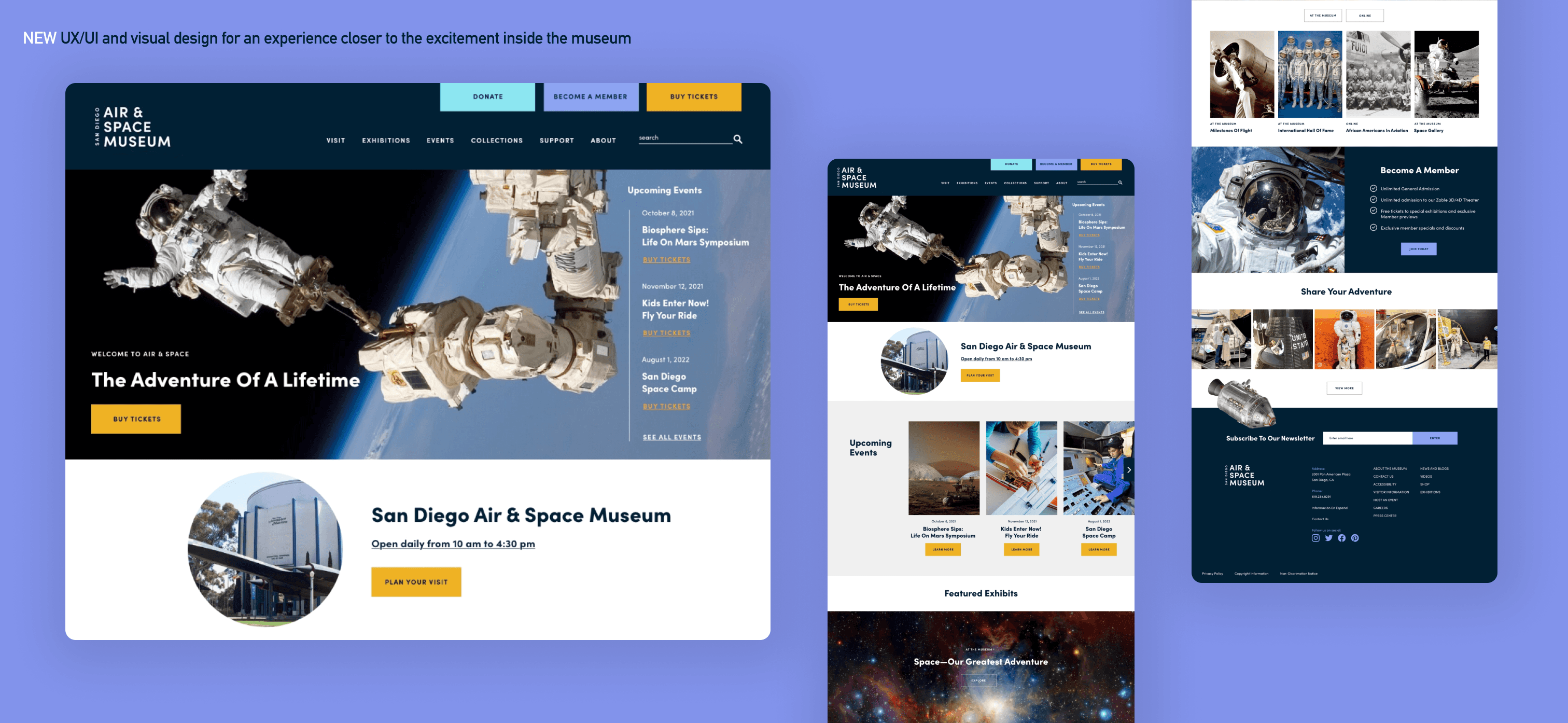
I focused on creating a cohesive, intuitive experience across digital and physical environments: A simplified, easier-to-navigate website structure Bold, immersive visuals that highlight real artifacts and exhibits Clear, confident calls to action at key decision points Consistent branding across web, signage, and wayfinding A refreshed, bolder logo treatment for improved readability and presence
Excitemend. Discovery. Anticipation. The goal was to make the museum feel as inspiring from the outside as it is inside—creating a sense of wonder that motivates guests to visit, explore, and support the institution.
Designing The Journey:
I focused on creating a cohesive, intuitive experience across digital and physical environments: A simplified, easier-to-navigate website structure Bold, immersive visuals that highlight real artifacts and exhibits Clear, confident calls to action at key decision points Consistent branding across web, signage, and wayfinding A refreshed, bolder logo treatment for improved readability and presence
Collaboration & Creative Leadership:
While this was a solo design effort, I partnered closely with the CTO to ground design decisions in business realities. Together, we reviewed ticket sales and membership data, comparing direct SDASM memberships with the Balboa Park Explorer Pass to better understand user behavior and conversion opportunities.
Methods & Craft:
Concept Direction: ✦ The scavenger hunt reframes the museum as a guided adventure. ✦ Instead of scanning QR codes or tapping through still screens: ✦ Guests follow a walking avatar through the museum ✦ Space-themed characters appear at specific exhibits ✦ Characters feel animated and alive, even on simple displays ✦ The app behaves more like a digital tour guide than a traditional mobile game. Addressing Parent Concerns: ✦ To ensure the experience supports in-person learning: ✦ Characters are strategically placed along the museum’s natural walking path ✦ Screen time is brief, intentional, and tied directly to physical exhibits ✦ The app encourages guests to look up, move around, and engage with real objects ✦ Future updates could introduce new characters or limited-time content to encourage return visits, without requiring constant or repeated gameplay. Experience Flow: 1. Arrival & Start: ✦ Guests launch the app and are introduced to an avatar that explains the mission and sets expectations for the visit. 2. Guided Exploration: ✦ As families move through the museum, the avatar: ✦ Stops guests at key exhibits ✦ Introduces a space-themed character tied to that exhibit ✦ Provides short, age-appropriate explanations of what they’re seeing 3. Interactive Moments: ✦ Instead of battles, interactions are designed as: ✦ Short trivia challenges ✦ Observation-based questions ✦ Simple decision points that reinforce learning ✦ Correct answers allow guests to collect the character. 4. Completion & End State: ✦ The experience has a clear conclusion ✦ The game ends once all characters are collected or the visit is complete ✦ No endless loops or continuous play


Key Experiences Delivered:
Clearer differentiation and explanation of membership offerings Improved discoverability and clarity for events and exhibits Strong, prominent CTAs for ticket purchases and memberships A unified visual system that connects digital and on-site experiences
Designing
The Journey:
I focused on creating a cohesive, intuitive experience across digital and physical environments: A simplified, easier-to-navigate website structure Bold, immersive visuals that highlight real artifacts and exhibits Clear, confident calls to action at key decision points Consistent branding across web, signage, and wayfinding A refreshed, bolder logo treatment for improved readability and presence

Collaboration & Creative Leadership:
Reflection.
Why It Mattered:
While this was a solo design effort, I partnered closely with the CTO to ground design decisions in business realities. Together, we reviewed ticket sales and membership data, comparing direct SDASM memberships with the Balboa Park Explorer Pass to better understand user behavior and conversion opportunities.
When a museum holds world-class artifacts and stories, guests should feel that magic before they ever walk through the doors. By revealing more of what’s inside—through compelling visuals, clearer information, and a confident brand presence—this work helps attract new visitors, increase support, and ensure guests arrive excited and leave inspired.
Methods & Craft:
Concept Direction: ✦ The scavenger hunt reframes the museum as a guided adventure. ✦ Instead of scanning QR codes or tapping through still screens: ✦ Guests follow a walking avatar through the museum ✦ Space-themed characters appear at specific exhibits ✦ Characters feel animated and alive, even on simple displays ✦ The app behaves more like a digital tour guide than a traditional mobile game. Addressing Parent Concerns: ✦ To ensure the experience supports in-person learning: ✦ Characters are strategically placed along the museum’s natural walking path ✦ Screen time is brief, intentional, and tied directly to physical exhibits ✦ The app encourages guests to look up, move around, and engage with real objects ✦ Future updates could introduce new characters or limited-time content to encourage return visits, without requiring constant or repeated gameplay. Experience Flow: 1. Arrival & Start: ✦ Guests launch the app and are introduced to an avatar that explains the mission and sets expectations for the visit. 2. Guided Exploration: ✦ As families move through the museum, the avatar: ✦ Stops guests at key exhibits ✦ Introduces a space-themed character tied to that exhibit ✦ Provides short, age-appropriate explanations of what they’re seeing 3. Interactive Moments: ✦ Instead of battles, interactions are designed as: ✦ Short trivia challenges ✦ Observation-based questions ✦ Simple decision points that reinforce learning ✦ Correct answers allow guests to collect the character. 4. Completion & End State: ✦ The experience has a clear conclusion ✦ The game ends once all characters are collected or the visit is complete ✦ No endless loops or continuous play
Designing for kids also meant designing for parents. The experience needed to feel less like a game and more like a trusted museum guide—engaging for kids and reassuring for adults.
Reflection.
Why It Mattered:
When a museum holds world-class artifacts and stories, guests should feel that magic before they ever walk through the doors. By revealing more of what’s inside—through compelling visuals, clearer information, and a confident brand presence—this work helps attract new visitors, increase support, and ensure guests arrive excited and leave inspired.
The Story Begins: The Challenge
Design a scavenger hunt app that: ✦ Encourages families to return to the museum ✦ Feels exciting and age-appropriate for kids and teens ages 7–18 ✦ Enhances physical exhibits rather than pulling attention away from them ✦ Is simple and clean enough to be developed and maintained in-house
The Vision:
Excitemend. Discovery. Anticipation. The goal was to make the museum feel as inspiring from the outside as it is inside—creating a sense of wonder that motivates guests to visit, explore, and support the institution.
Designing The Journey:
I focused on creating a cohesive, intuitive experience across digital and physical environments: A simplified, easier-to-navigate website structure Bold, immersive visuals that highlight real artifacts and exhibits Clear, confident calls to action at key decision points Consistent branding across web, signage, and wayfinding A refreshed, bolder logo treatment for improved readability and presence
Key Experiences Delivered:
Clearer differentiation and explanation of membership offerings Improved discoverability and clarity for events and exhibits Strong, prominent CTAs for ticket purchases and memberships A unified visual system that connects digital and on-site experiences
Collaboration & Creative Leadership:
While this was a solo design effort, I partnered closely with the CTO to ground design decisions in business realities. Together, we reviewed ticket sales and membership data, comparing direct SDASM memberships with the Balboa Park Explorer Pass to better understand user behavior and conversion opportunities.
Methods & Craft:
Concept Direction: ✦ The scavenger hunt reframes the museum as a guided adventure. ✦ Instead of scanning QR codes or tapping through still screens: ✦ Guests follow a walking avatar through the museum ✦ Space-themed characters appear at specific exhibits ✦ Characters feel animated and alive, even on simple displays ✦ The app behaves more like a digital tour guide than a traditional mobile game. Addressing Parent Concerns: ✦ To ensure the experience supports in-person learning: ✦ Characters are strategically placed along the museum’s natural walking path ✦ Screen time is brief, intentional, and tied directly to physical exhibits ✦ The app encourages guests to look up, move around, and engage with real objects ✦ Future updates could introduce new characters or limited-time content to encourage return visits, without requiring constant or repeated gameplay. Experience Flow: 1. Arrival & Start: ✦ Guests launch the app and are introduced to an avatar that explains the mission and sets expectations for the visit. 2. Guided Exploration: ✦ As families move through the museum, the avatar: ✦ Stops guests at key exhibits ✦ Introduces a space-themed character tied to that exhibit ✦ Provides short, age-appropriate explanations of what they’re seeing 3. Interactive Moments: ✦ Instead of battles, interactions are designed as: ✦ Short trivia challenges ✦ Observation-based questions ✦ Simple decision points that reinforce learning ✦ Correct answers allow guests to collect the character. 4. Completion & End State: ✦ The experience has a clear conclusion ✦ The game ends once all characters are collected or the visit is complete ✦ No endless loops or continuous play
Reflection.
Why It Mattered:
When a museum holds world-class artifacts and stories, guests should feel that magic before they ever walk through the doors. By revealing more of what’s inside—through compelling visuals, clearer information, and a confident brand presence—this work helps attract new visitors, increase support, and ensure guests arrive excited and leave inspired.
Collaboration & Creative Leadership:
While this was a solo design effort, I partnered closely with the CTO to ground design decisions in business realities. Together, we reviewed ticket sales and membership data, comparing direct SDASM memberships with the Balboa Park Explorer Pass to better understand user behavior and conversion opportunities.
Methods & Craft:
Concept Direction: ✦ The scavenger hunt reframes the museum as a guided adventure. ✦ Instead of scanning QR codes or tapping through still screens: ✦ Guests follow a walking avatar through the museum ✦ Space-themed characters appear at specific exhibits ✦ Characters feel animated and alive, even on simple displays ✦ The app behaves more like a digital tour guide than a traditional mobile game. Addressing Parent Concerns: ✦ To ensure the experience supports in-person learning: ✦ Characters are strategically placed along the museum’s natural walking path ✦ Screen time is brief, intentional, and tied directly to physical exhibits ✦ The app encourages guests to look up, move around, and engage with real objects ✦ Future updates could introduce new characters or limited-time content to encourage return visits, without requiring constant or repeated gameplay. Experience Flow: 1. Arrival & Start: ✦ Guests launch the app and are introduced to an avatar that explains the mission and sets expectations for the visit. 2. Guided Exploration: ✦ As families move through the museum, the avatar: ✦ Stops guests at key exhibits ✦ Introduces a space-themed character tied to that exhibit ✦ Provides short, age-appropriate explanations of what they’re seeing 3. Interactive Moments: ✦ Instead of battles, interactions are designed as: ✦ Short trivia challenges ✦ Observation-based questions ✦ Simple decision points that reinforce learning ✦ Correct answers allow guests to collect the character. 4. Completion & End State: ✦ The experience has a clear conclusion ✦ The game ends once all characters are collected or the visit is complete ✦ No endless loops or continuous play
Key Experiences Delivered:
Clearer differentiation and explanation of membership offerings Improved discoverability and clarity for events and exhibits Strong, prominent CTAs for ticket purchases and memberships A unified visual system that connects digital and on-site experiences